Explore the Demo and Learn How It Works!
Dashboard Creation
To create a dashboard, go to the "Dashboards" section and click "Create Dashboard". Give your dashboard a name and description, then save it. Once created, you can add charts by selecting "Edit Dashboard" and choosing "Add Chart" to insert visualizations you’ve already created. Arrange and resize the charts to design your layout as needed. Once complete, save and publish the dashboard to share.
Chart Creation
To create a chart, start by selecting your dataset and navigating to the
"Charts"
section. Choose the type of chart you want (e.g., Bar Chart, Line Chart, Pie Chart). Set your axes and data points, selecting columns from your dataset to represent the x-axis, y-axis, and any additional parameters like size or color. Once your chart is configured, you can preview it and save it to your dashboard.
CHART TYPES
Transforming data into insights with professional, visually stunning charts tailored to your needs
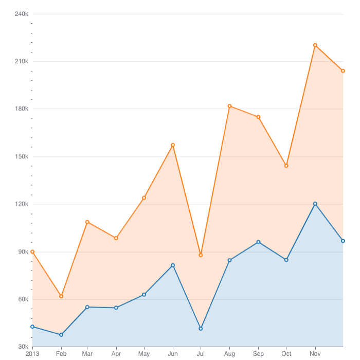
Area Chart
To create an Area Chart in DHN, select your dataset and choose "Area Chart" from the Charts section. Set the x-axis to a time column like Year and the y-axis to a value like Population. You can group data by categories like Province to compare regions. Customize the chart with labels and colors, run the query to preview, and save it to your dashboard.
For example, use an Area Chart to show how the population has grown over time in different provinces.
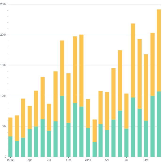
Bar Chart
To create a Bar Chart in DHN, select your dataset and choose "Bar Chart" from the Charts section. Set one axis to categories like Province and the other to a value like Number of Schools. You can group or stack data to compare multiple categories. Customize the chart with labels and colors, run the query to preview, and save it to your dashboard.
For example, use a Bar Chart to compare the number of schools in different provinces.
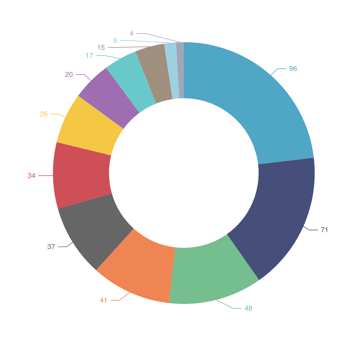
Pie Chart
To create a Pie Chart in DHN, select your dataset and choose "Pie Chart" from the Charts section. Set a categorical column, like Province, for the segments and a numerical value, such as Number of Schools, to represent the size of each segment.
For example, use a Pie Chart to show the proportion of schools in each province compared to the total number of schools in the country.
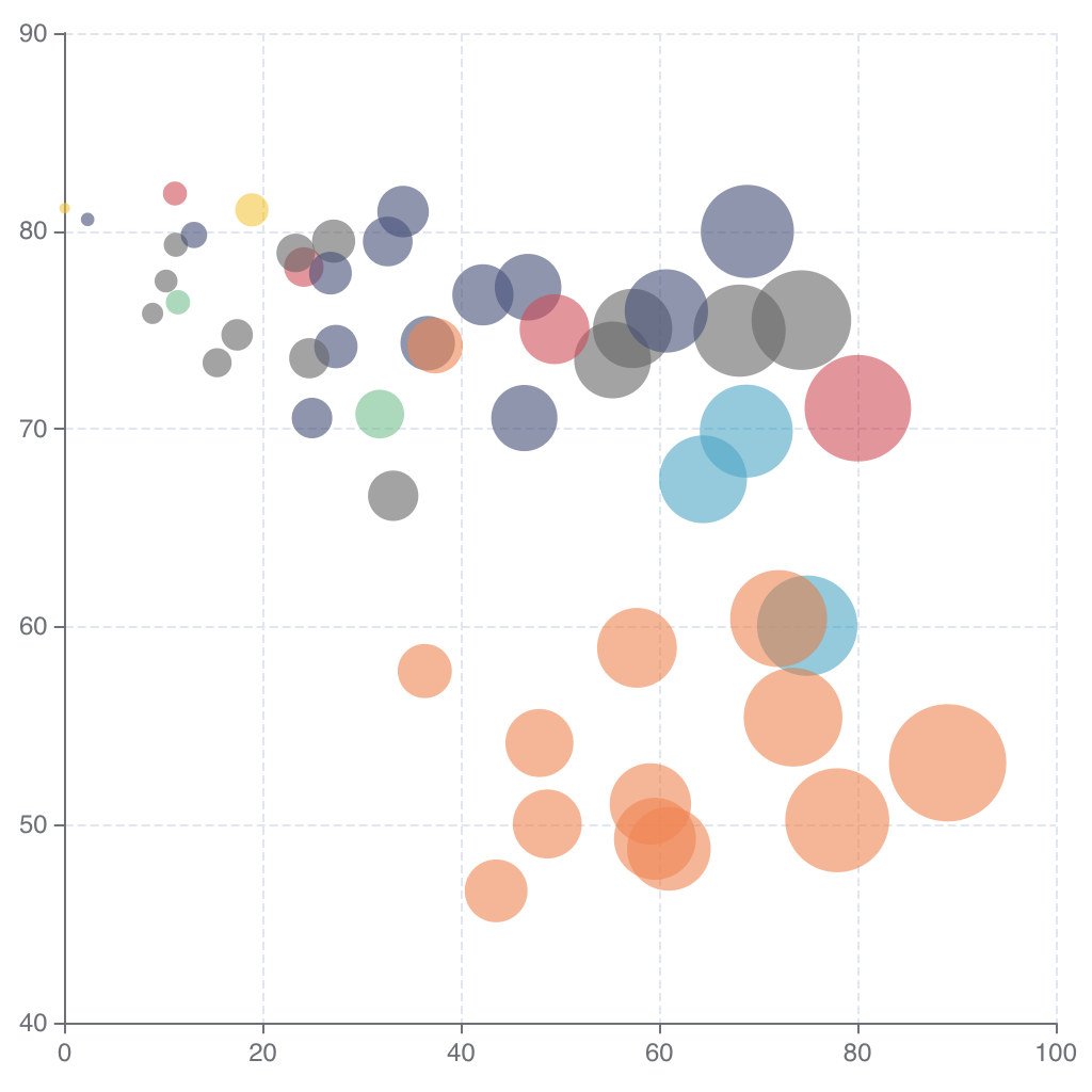
Bubble Chart
To create a Bubble Chart in DHN, select your dataset and choose "Bubble Chart" from the Charts section. Assign values to the x-axis (e.g., Population), y-axis (e.g., Number of Schools), and bubble size (e.g., Literacy Rate).
For example, use a Bubble Chart to show the relationship between population, schools, and literacy rates across regions.
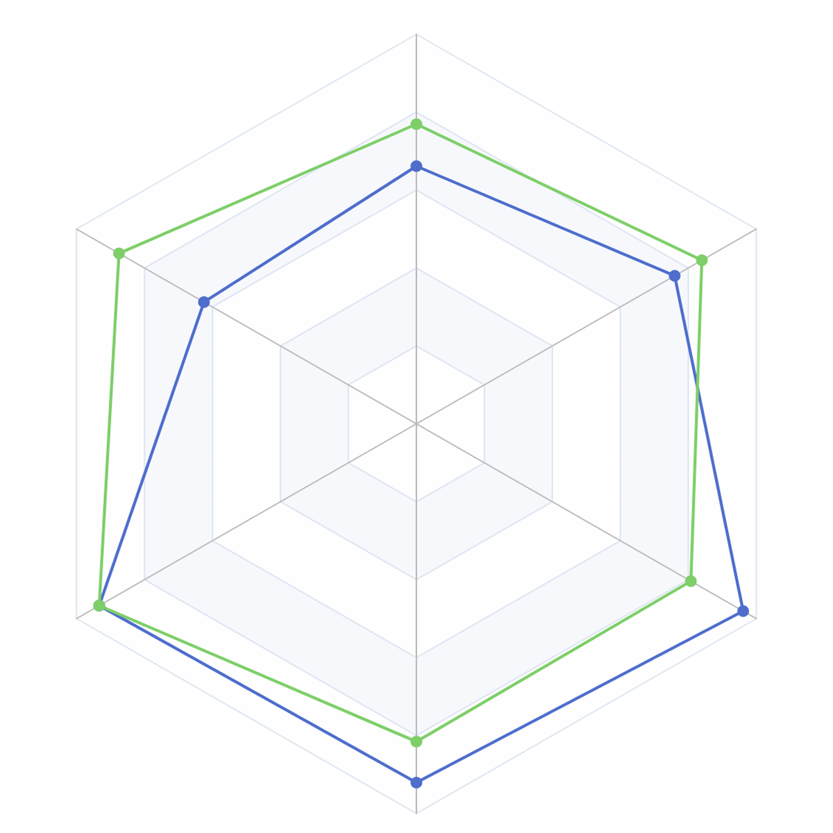
Radar Chart
To create a Radar Chart in DHN, select your dataset and choose "Radar Chart" from the Charts section. Set a categorical column for the different axes (e.g., Province) and numerical values to show the data points (e.g., Average Test Scores).
For example, use a Radar Chart to compare the average test scores of different provinces in various subjects.
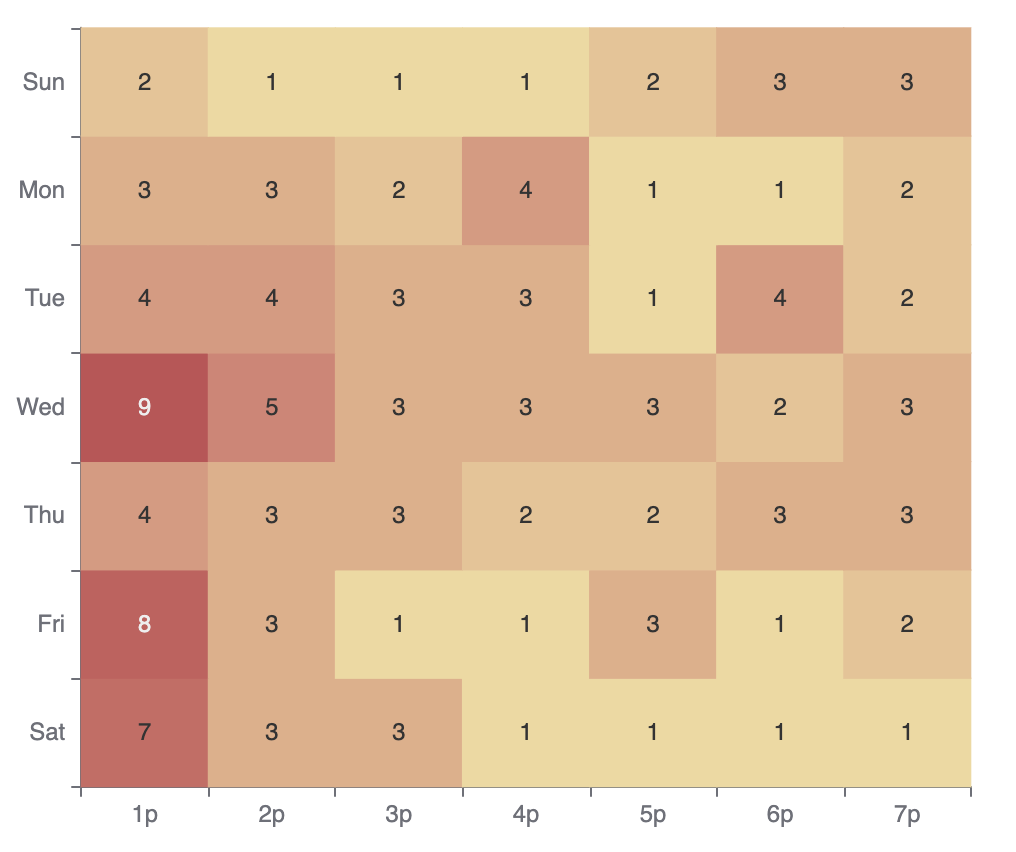
Heat Map
To create a Bar Chart in DHN, select your dataset and choose "Bar Chart" from the Charts section. Set one axis to categories like Province and the other to a value like Number of Schools. You can group or stack data to compare multiple categories.
For example, use a Bar Chart to compare the number of schools in different provinces.
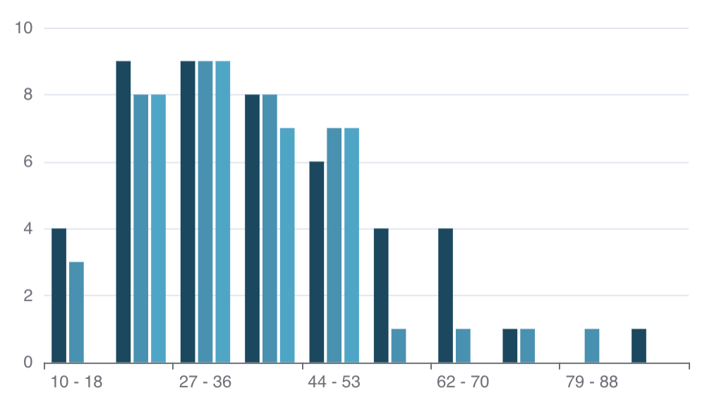
Histogram
To create a Histogram in DHN, select your dataset and choose "Histogram" from the Charts section. Set a numerical column, like Income, to group data into bins and visualize how values are distributed.
For example, use a Histogram to show the distribution of household incomes in different regions.
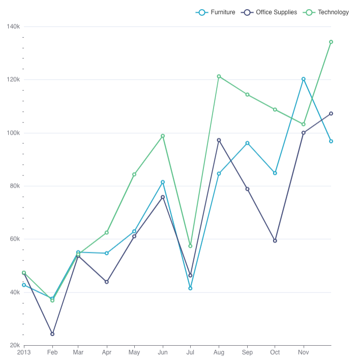
Line Chart
To create a Line Chart in DHN, select your dataset and choose "Line Chart" from the Charts section. Set a time column, like Year, for the x-axis and a numerical value, such as Literacy Rate, for the y-axis to show changes over time.
For example, use a Line Chart to display the trend of literacy rates in Nepal over the past decade.
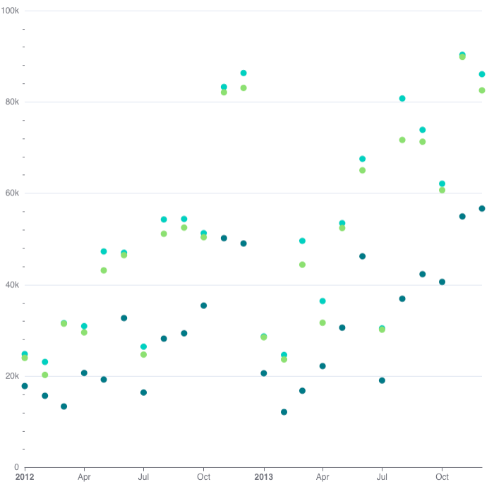
Scatter Plot
To create a Scatter Plot in DHN, select your dataset and choose "Scatter Plot" from the Charts section. Set one numerical column for the x-axis (e.g., Population Density) and another for the y-axis (e.g., Number of Hospitals).
For example, use a Scatter Plot to explore the relationship between population density and the number of hospitals in different regions.